
Balancing Lineart and Coloring in Your Drawings
Today, I want to share a trick you can use in your drawings: balancing lineart, specifically the amount of detail to show in relation to the coloring.
Style is always a personal choice—you can go for a simple, graphic line or a highly detailed and intricate one, whether precise or chaotic, with endless possibilities in between. There’s no right or wrong! This is just about being smart and using techniques to your advantage.
Knowing how to manage and balance the level of detail in your inking can be especially useful if you have only a few Copic markers and your drawing feels a bit flat.
For this tutorial, I’m using a digital lineart to make the examples clearer.
Here’s the subject:
Flower petals, clothing folds, and hair textures are great sources of detail!
Now, let’s look at two examples: a simple lineart and a detailed lineart, along with their respective colorings.
⚠️ Important:
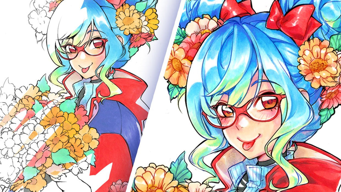
I created these examples just for educational purposes to highlight the differences. Normally, I ink my drawings before coloring, but you don’t have to follow this exact process—especially if you don’t work digitally!Lineart semplice e dettagliata dopo colorazione con i Copic
The right-side coloring is simple and clean. It’s not entirely flat because I added a few sharp shadows and soft gradients for volume, but it’s a great beginner-friendly example. The alcohol-based Copic ink allows for smooth, even color application, creating a neat and polished look! The flowers, in particular, were colored flat, with careful attention to staying within the lines.

The left-side coloring is highly detailed—you can understand the volume even without the lineart (again, this is just a demo; follow your usual coloring steps!). This version uses many more colors, shadows, and highlights, creating a richer effect. More shading means more colors!
Final Drawings with Both Lineart Styles
The best balance is to pair simple coloring with a detailed lineart, and vice versa. Neither version looks rushed or overly chaotic.

Adding more detail to the lineart gives character to an otherwise simple drawing—maximum impact with minimal coloring effort! This technique works for everyone.
(You can also adjust line thickness, but that’s more relevant for inking techniques rather than Copic coloring.)
This is why I separated the lineart and coloring: to show how the results would change if we swapped them—combining detailed lineart with detailed coloring or simple lineart with simple coloring. You can see that too many lines interfere with beautiful shading effects.
This happens because the eye perceives contrast more strongly in dark outlines, making the surrounding colors lose some detail.
Both versions are visually appealing—it all depends on personal preference! But if you want the colors to stand out, let them take the spotlight by keeping the lineart softer. Remove extra folds and let the shading do the work!
Colored Lineart with Copic Multiliners
You can also choose to color the lineart—this is my favorite option! Copic Multiliners come in many shades, and in this case, sepia, blue, and pink worked beautifully.
Even a highly detailed lineart can be softened by reducing contrast through coloring. This preserves all the subtle details of your shading.
Alice